EASTWOOD · KITCHEN DESIGN
Same footprint,
better flow.
A kitchen design for a pre-war Eastwood house, extended in the 1990s. The footprint was fixed, so the work went into layout, storage and a warmer palette.
Concept design · 3D rendering · Documentation · Joinery drawings
Discover the project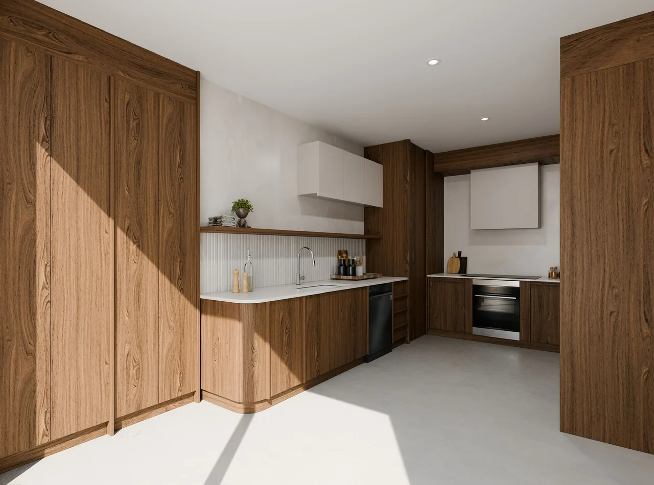
- Property
- Pre-war house, Eastwood
- Aera's role
- Design only: concept, documentation and joinery drawings
- Scope
- Kitchen layout, joinery, materials and appliances
- Constraint
- Fixed footprint
THE BRIEF
A kitchen that suits
how the family lives.
The owners are a young family updating their home. They wanted a new kitchen that suited how they cook and live, with more storage, better flow and more usable space.
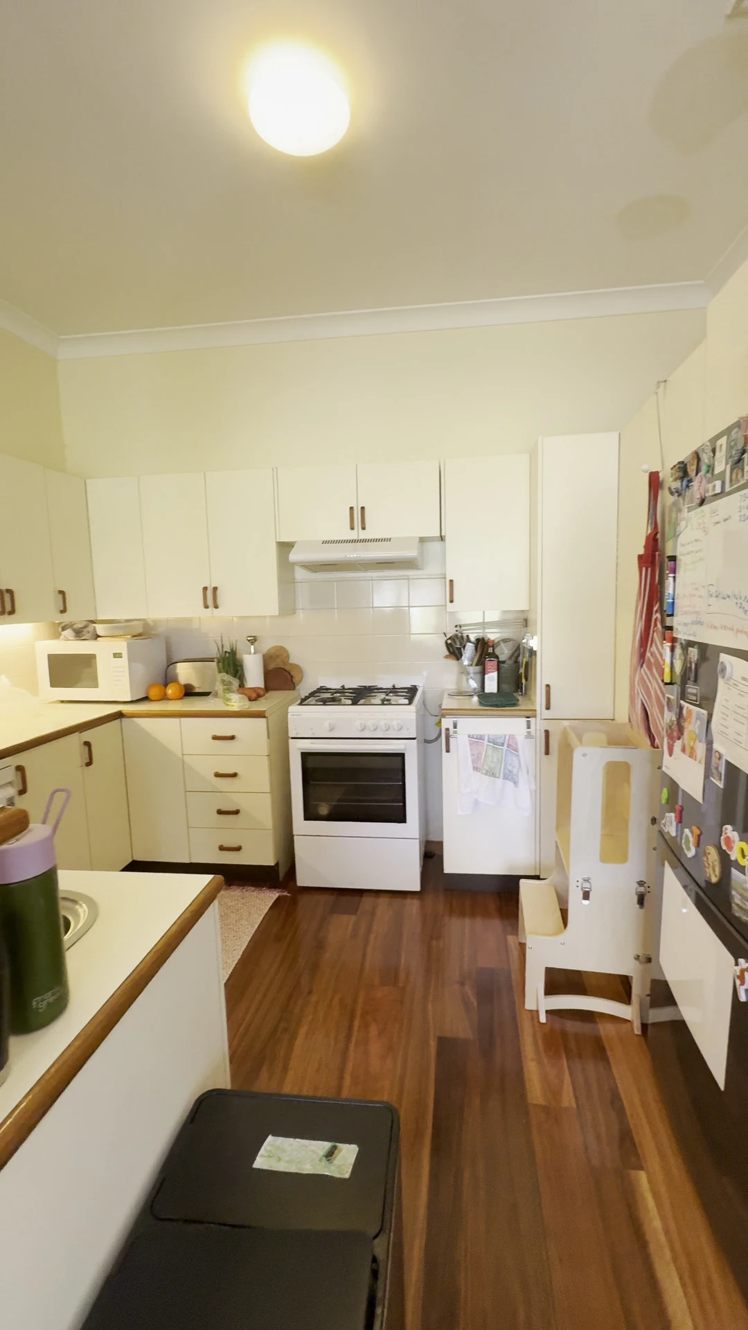
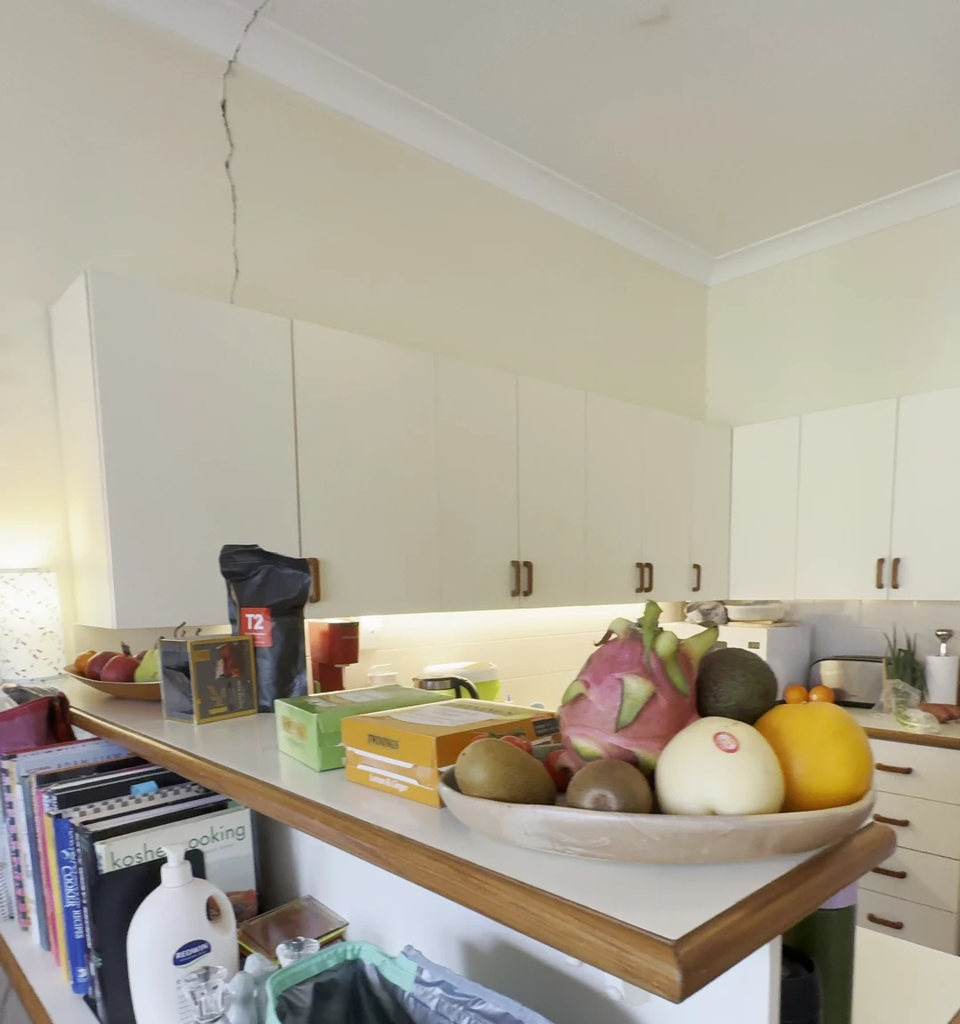
The existing kitchen was dated and U-shaped, with compromises around storage and movement. The dining area beside it was cramped. Remediating a crack in the ceiling was a further reason to renovate.
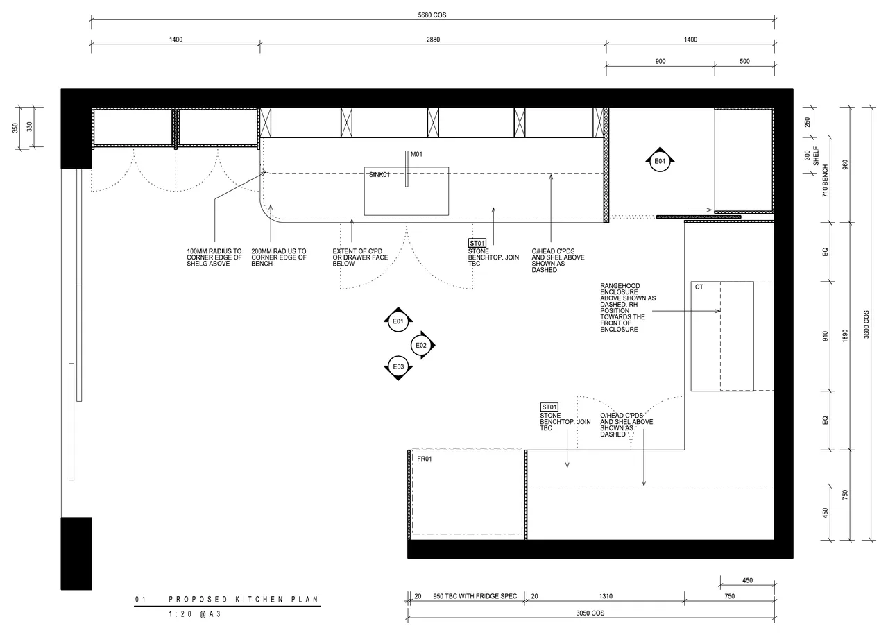
The footprint was fixed. We explored opening up a wall and adding a small walk-in pantry, but the owners preferred to keep the U-shape, so the design works within it.
The decisions behind
the design.
Peninsula bench
A two-tier peninsula bench projected into the room and cut the kitchen off from the dining area.
Remove it.
Clearer flow, and more room for the dining area beside it.
U-shaped layout
The kitchen was already U-shaped.
Keep the U. Other layouts, a wall opening and a walk-in pantry were all explored.
A layout the owners were comfortable with, improved within a fixed footprint.
Cooktop and sink
A freestanding gas oven and a basic rangehood sat in the corner.
Build in the oven and cooktop, conceal the rangehood and reposition the sink.
Work zones planned together around how the family cooks.
Storage
Storage was limited and scattered.
Add a full-height storage wall, a sliding-door pantry and a bin zone under the sink.
A place for each, within the same footprint.
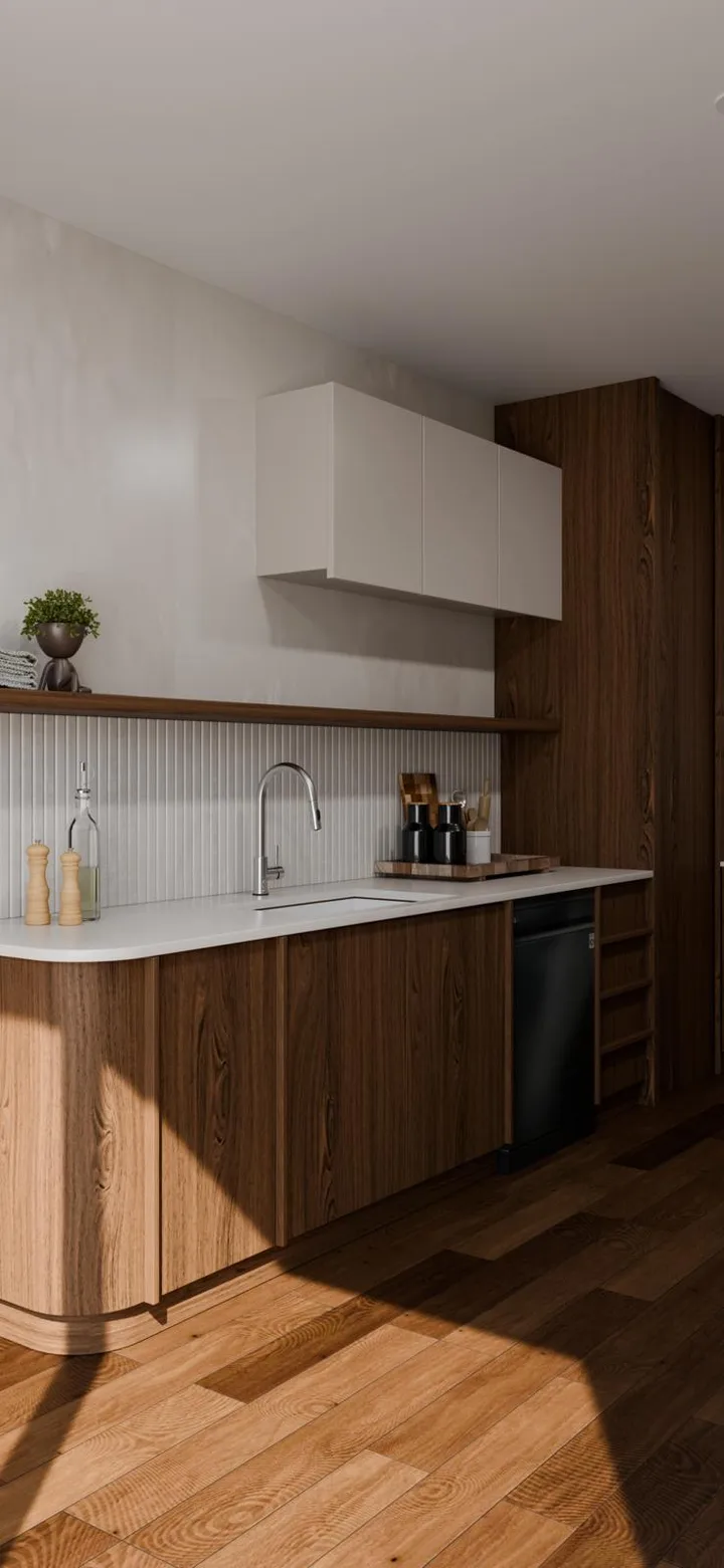
Curved corner
The sink run ends at the main walkway.
Round the corner with a 200 mm radius.
Easier circulation, a softer edge and a safer one for children.
Bulkhead and shelf
Conduit and exhaust needed hiding, and cabinetry on every wall would feel heavy.
Wrap the services in a timber bulkhead and keep one shelf open.
Concealed services, added contrast and a lighter room.
THE KITCHEN
Removing the bench,
keeping the shape.
The old kitchen was U-shaped, with a laminate peninsula bench that projected into the room and a cramped dining area beside it. We removed the bench and kept the U, which opened up the floor and gave the dining area more room.
Within the same footprint, we built in the oven and cooktop, repositioned the sink and organised storage into dedicated zones, including a full-height storage wall, a sliding-door pantry and a bin zone under the sink.
A curved corner at the end of the sink run softens the main walkway. A timber bulkhead over the cooktop conceals conduit and exhaust and adds contrast. One shelf stays open, so the U-shape does not become cabinetry end to end. Handleless joinery pulls, soft-close drawers and recessed LED strip lighting keep the lines clean.
MATERIALS & FINISHES
Warm oak,
kept light.
The owners asked for warmth. Polytec oak joinery provides it, set against white overhead cabinets, microcement on the rear walls and Caesarstone Blizzard benchtops, so the room stays light.
A ribbed kit-kat tile splashback adds texture without adding colour.
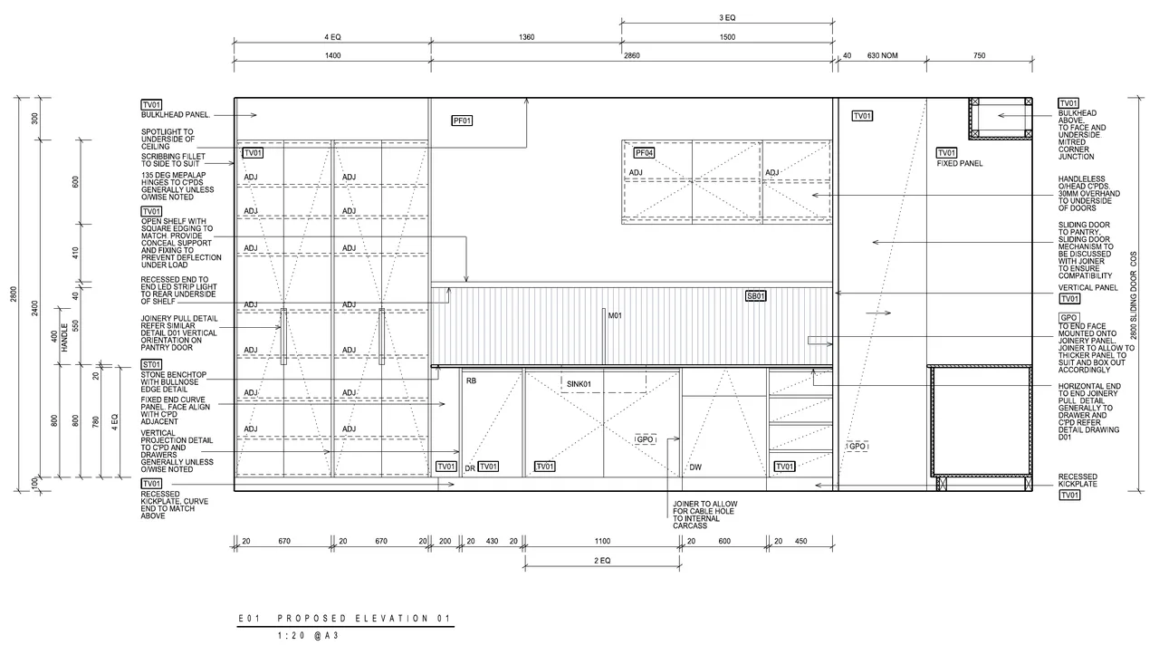
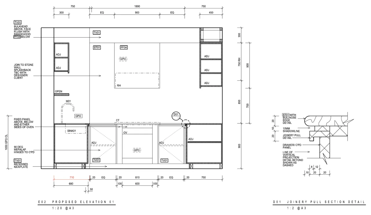
FROM DESIGN TO REALITY
Documented for
a builder to price.
Explore the plans & elevations
OUR ROLE
Design, documented
in full.
Aera designed the kitchen as a standalone design service. We delivered the concept, a 3D render, plans, elevations, joinery drawings, a selection schedule and appliance specifications. The owners wanted design-led documentation ready for a builder to work from.
YOUR NEXT CHAPTER